Sunday, 19 April 2015

Studio Brief 2 - Branding research

Branding is an aspect of design in which every designer will end up producing, either for themselves or for other companies. When branding is done correct, it should represent the company in every shape and form. The tone of voice, target audience and style should all portray your self or the company. All these aspects need to be communicated through a variety of resolutions.

If the brand is correctly represented, then your company or yourself can lose credibility and become very mundane and just another company try to be cleaver. Brand consistency is also very important in order to uniform your identity and create an iconic design which can be recognisable in an instant.


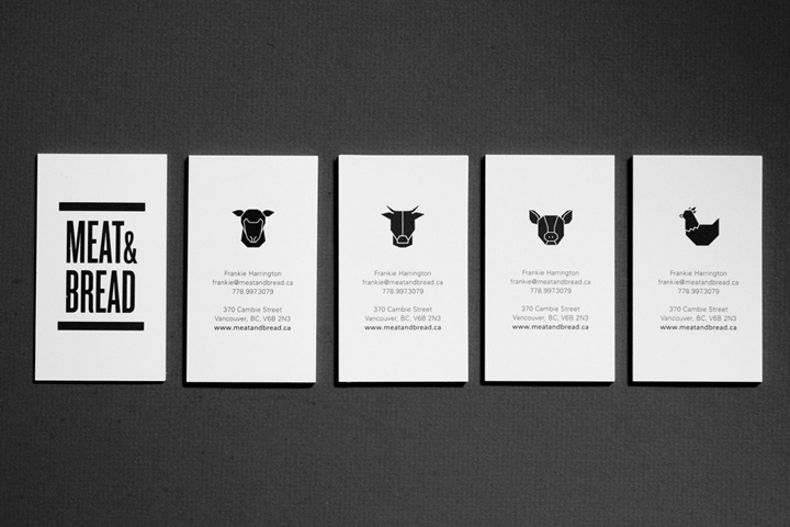
Very modern and contemporary design for the identity here. Using symbols on the business cards can be very effective. Firstly the symbol can represent different categories, and in effect opening up a number of areas through a simple business card. Second, the symbols, if replicated on most collateral will end up being iconic to this brand. Once something is iconic then it will always be associated with the brand.  Great talking point between the company and client as they talk about the individual animals and what each of them mean.
Looking at not just the design within the brand but also the kind of stock and materials you use can be the most important aspect to represent your brand. I couldn't find out what brand this was. However as an example. The brand could be Eco friendly brand so choosing cardboard or other sustainable resources would be a better approach to represent the brand. Having different kind of material is highly recognisable and even contemporary within today's Graphic Design. 
Having something different and 'out there' may be risky and experimental but if it's pulled off well then it can be what sets you apart from everyone else. Interacting with clients is also a bonus. Making them active within the brand and getting them involve is more remember able then just a plain bog standard business card with the logo and contact detail on.

The above business card represents this extremely well. Taking the business cards and frame your own perfect picture is including the client therefore creating a connection and making your brand apart of his life.

Identity as a collateral. In this format brand consistency is extremely important. Forming colour schemes and symbols that can represent your brand is very beneficial. The brand above have used the striped from their logo across all collateral, which in return will make your brand uniform as one. The more stuff you put your branding on the further your message and ideas will go. 
Beautiful designs. Linking the floral design from one design to the other will give the brand that extra boost and creative edge. Using light and cool colour is appropriate for the floral brand.  Inviting and contemporary.

Other examples of interactive business cards. Good examples for self branding. Taking a feature which is a feature that is only unique to you and branching out from that. If you have big boobs, big belly or bendy legs. All of these can effectively be represented in a creative manner. 

Studio Brief 2 - Ideas and concepts

Concept 1

This idea is based around my hair. When most people see me, they always mention my hair, whether it being the best hair they've ever seen or the worse. Either way it's the most recognisable feature of my self. With this in mind i decided to use this visual appearance and use it to represent me personally, giving me a unique & again personal connection with the user/client.

1 - Having my name within the shape of my hair. The typeface will have the look and feel of hair. Personal and easily relatable to me as an individual.

2 - Having an illustrative character of me as a symbolic logo. Having this as a logo would be beneficial to have as a symbol across all main branding.  Vector illustration would be more beneficial then a photo due to me being able to size it as big and small as i want.

3 - Forming the type into one design. Type is meant to look like it's apart of the hair. More elegant and script style.

4 - This sketch is in the form of how the business card could look like. The business card is mainly taking up by my hair shapes with the text inside. Having the design like this will be a great talking point and be very recognisable with my self.


Concept 2

This concept is simple but highly effective if pulled off well. Using my name "Jack" with in a box. At first glance, the user will just notice the word jack within a box but then connect and link that with the common term "Jack in the box". Jack in the box allows me to incorporate a contemporary style, due to the shapes being very popular with contemporary design.

1 - My name in a modern typeface face, with corners of the box visible. Not having the full box will allow the type to have room to breath and not be constricted by the box

2 - Contemporary style of the logo. Not much to say about this sketch apart from the style being very popular with design at the moment.

3 - A tetris kind of type style. Text within a box appearing as though all the letters are being stacked up onto each other.

4 - Same style as idea one but instead the box is closed. This way the concept is easier to figure and understand.

5 - Similar to the previous idea but having a different shape for the boxes. Including the side parts of the box will make the concept obvious hopefully. The side may be a bit to much, as i would like the concept to not be as obvious but a great way for the client to figure out.

concept 3

This is probably my most strongest concept for my personal branding. For this concept of branding i have ditched my name for the word 'child'. For me children have certain traits & attributes which we as adults lose once we grow. Child is more then just a personal identity for my self but a brand. Children are imaginative, open minded and honest, which we lose in adult hood and this is what I'm trying to represent in my branding.

1 - Script typeface, hand-drawn lettering which leads to the child's face. This design may be a bit overkill, it's a great to experiment with different styles.

2 - A silhouette of a child's face, which has been morphed into a apart of a light bulb. This idea will represent, creativity and new ways of thinking.

3 - Having the word "child" in a modern typeface, either Helvetical or Futura. Working with negative space on the 'd' by having the silhouette of the child's face within the 'd' negative space.

4 - This logo is more about representing a child more then actually linking it back to me personally. using a different primary colour of each letter links strong to a child like style. However I'm not sure how well this would be perceived as it may not look like a logo for a design company.

5 - Trying to create a symbol for child which could be used a the main image instead of using text.

6 - Trying to communicate the child concept on business cards. This idea is to have the game twister Incorporated onto the business card. Interactive nature will make the business more personally and interactive between me and the client.

7 - Using the maze game on the back of the business card. Something interactive which the client could take away and play with in their own time.
Brief 2 - Final Crit presentation

To prepare for the final crit, i created a presentation which summed up my personal branding so far. Hopefully from the crit i can get a sense of if I'm going in the right direction, in terms of meeting the brief and also any constructive criticism around the design and concept of my work.


Studio brief 2 - Who am i?

Who am i as a designer?

Right now I don't see myself edging towards a certain side of Graphic Design. At this moment in time i see my self as someone who is well rounded in design. I've had experience in a lot of areas, which I am lucky enough to have gained. I've generated a lot of experience on a number of software. Photoshop, Indesign, Illustrator and Dreamweaver are all the programs in which i have a lot of knowledge in. I think being a well rounded Graphic designer is very beneficial in terms of flexibility and moving from one brief to another without the worry of incompetence and thinking whether or not i have enough skill to tackle this brief head on.

What style of work do i have?

Before coming to uni, the type of style i had was very grunge-like. I only applied my gunge style to photo manipulation and never on other areas like typography and layouts for magazines or books. Since coming to LCA I've learnt to embrace my style and to not limit my style to one area. Being more open and expressionist, I've started to use a post-modern style to express my voice and opinions through typography and layout designs. I've also learnt to love modern approaches on a simplistic format. Carefully choosing typeface and colour to really maximise your message in a modern/ contemporary manner. I've gained massive respect and love for Vignelli, his ideas and persona around his work is second to none, which i have come to admire.

Where do i see my direction within Graphic Design?

  I see my direction to be expressionism within a post-modern/David Carson fashion. In produced my work for design principles, I've fallen in love with the style. Making layouts and grids in a post-modern way, then linking this in an expressionistic manner, whether it comes across explicit or controversial is the area that I'm deeply into.

What do i want to represent in my  self branding?


This has caused a lot of thought. I would love to represent myself in the most creative way. However being to creative with a post-modern approach could confuse clients, which i would only be limiting my self at a certain target audience, as the tone of voice for that kind of style is very in your face and demanding. Therefore, i want a style/approach that i can reach out to a larger audience. An approach which can set my self apart from other self branded designers. Something extra. Something more personal. Something which is more then just a self identity about myself. A brand that connects me and the client on a personal venture.


Studio Brief 2 - Previous branding

Before coming to university, I entered a lot of competitions through design marketplaces. Through these competitions, I ended up producing a lot of branding stuff, mainly business cards but sometimes logos and sometimes whole collateral. When designing, It was important to take on board what was asked of me in the brief. Understand the brand is key, so researching the company before hand was always my first step. The style and feel of the brand is also important. Are they corporate? feminine? modern? whats the tone of voice? who are there audience? all these aspects come into my mind and effectively shape and change the way i design for that specific brand

Below are some examples:


Studio Brief 1 & 2 - Mother

I came across mother a couple years ago, while researching Advertising. I researched into their brand and heard stories (whether true or not) that they used to have every employees mother on the back of their business card for the company. Also I've found out that they play on the term Mother a lot. So for example, when answering the phone they answer by saying "Hello, Your mother is speaking". They approach things in a motherly fashion, which they could then control certain aspects and which in return makes them unique and a lot different from a lot of other brands in that area.

With this in my mind for a number of years, i always wanted to have a company that i could portray in the same way. So calling my identity 'Child' was a great opportunity to see what i could produce.

On Mothers website, the "people" section where it gives you an overview of everybody who works there. On closer inspection, one you hover off a person, their picture changes into the picture of their mother. This is the kind of thing i was talking about above. These kind of personal features make you feel apart of the brand. Makes you feel connected like a community of people. Not only seeing the person who works their but also seeing their family and viewing the most important person in their life. Their mothers.

Mothers business cards. Having a picture of the queen who is the main mother of Great Britain. Effective reflection on the company. Very attractive and a good ice breaker to open discussions. Even the design of the business card represents the queen very well. Traditional and elegant, along with the business card holder, which looks like the queens purse. All these small details go along way.


Studio Brief 2 - Further development


After the crit on Thursday, I had a lot of feedback and a discussion with John on about how i could further developed my personal identity. John mentioned that what i had designed/created is more then just a personal identity, it was the start of a brand. John suggested taking the concept of child further, by exploring the personal traits, which a child has but loses once reaching adulthood. Some traits which i listed out are in the image below.

Traits - Experimental, honest, open-minded, fun creative, imaginative, social, non-biased, young, fresh, care free and happy.
After listing some traits of a child, i wanted to come up with a tag line that i could use, which will instantly communicate and represent my concept of being a child again but not in the physical form but the lost attributes that we lose once we grow up.
I came up with the tagline "Keep it child" The strap line is open to interpretation and question. I like this name as it doesn't suggest being a child but to keep it child-like. Using this tag line plus the attributes that we lose one fully grown, i created a poster to promote the brand and to make a clear connection about the ethos and what 'child' represents.

This is the poster mocked up onto a wall/billboard. Works well with the environment and the colours, type still fit in with the brands colour scheme.


This is the poster idea for the brand. The words 'keep it' and 'child' are at the start and at the end of the text and both in the same colour. The poster represents the start and finish and all the traits a child is within the middle, almost suggesting these traits make up the main body of the design.


This is the branding on t-shirts.
Trendy t-shirt, this could work extremely to use my child face at the main focus of a clothing line.

Traits of a child poster that i created, i have applied to a t-shirt.


From the feedback on Thursday, it was suggested that i remove 'child' from the front of the business card as it looked a bit overpowered and busy. I took this feedback on board and removed the 'child' text from the front. On doing this, it opened up the design and gave the overall design breathing space. Also the image of the child is now the main focus point of the business card. I felt the need to add in my tag line on the front just to allow brand consistency and to get the concept more attention.

Brief 2 - Mock ups of branding.

Below are my designs so far, with my personal branding 'child'.

Front of business card. To add a personal touch to my branding, the concept of 'child' was a perfect opportunity for me to use myself as the main focus of my business cards and all other branding. Child is about showing off a child's traits. Children at a young age are honest, imaginative and open minded. Its all about showing the traits of a child but not necessarily representing a physical child. Having me as the main feature will give everything a talking point. People will ask me "why child?" "is that you as a child?". Everything starts with a introduction. I stuck with black and white, to keep the brand modern and clean without misrepresenting my company as anything other then a design company. Using a hint of yellow on the eyes brings the design alive and visually communicates vibrancy, depth and also it makes me into a superhero.
This is the finished mock up of the logo for 'child'. I wanted a logo which reflected a child but not in a way that could relate to a child-like company in any way. I designed the logo so it wouldn't look like a logo for a company about a children's nursery or a bouncy castle company. Futura was used for the typeface as it visually communicates a modern typeface and is strong, visually pleasing and readable. After playing around with the individual kerning the typeface become more of a logo and not just a word. I felt i also had a lot of room to play around with the negative space with child. I managed to subtly add in a child's face within the 'd' , this gives the logo more originality and links with the child aspect but not transforming the logo to much.


Back of business card.  Modern formatting, simple and straight to the point of what is needed. Also there is a room at the bottom for notes as it's a good idea for business cards to have space at the bottom just in case you need to change something or quickly write down a few notes for the person you're handing over the card too.

Business cards mounted onto mock ups.

Business cards.

Branding collateral. Used on letterhead, envelopes and business cards.

Studio brief 1 - AppStudio talk

Back in April of 2014 I went to lecture about an important piece of software that Incisive Media use at the time of my job there. What is App Studio? "App Studio is the next generation digital publishing solution that uses HTML5 to push the bounds of user experience without the high cost and effort associated with custom app development."


App studio was incorporated by Incisive media, as it was an easy platform to design and create ad apps through. You simply upload your app design through InDesign and then app studio will do the rest in terms of making the animation and buttons functional. As i was one of the designers creating ads that appear on the Ipads, i was asked to go to the talk and see what tips and tricks i could pick up on.

The talk was extremely informative, which i then later feed back to my team at Incisive. I also got a free app studio t-shirt :)

Saturday, 18 April 2015

Studio Brief 1 - Secret 7" Exhibition

This week i went to the Secret 7" exhibition. I was to pleased to be informed that i was one of the lucky chosen 700 to have my vinyl design included in the exhibition. Looking around the exhibition was very exciting as this was the first time I've ever had my artwork displayed inside a gallery. It was great to see all all 700 designs all together. 

It was clear to see from the exhibition that everyone had their own take on the different songs. Every ones concepts and the way they went about creating the vinyls were all very creative and original. Below are some picture i took from that night.


An overview of the Secret 7" gallery.
My sleeve on the wall (top)
(Top, middle)
My design being shown on secret 7" instagram.
My name on the wall as a contributor.