Thursday, 17 March 2016

Studio Brief 2 - Promotional Pack

A promo pack was essential to get my self out there, to showcase my work and who I am as a designer. It wasn't enough to just create a bog standard CV as the only place that would hire you is Argos. A creative CV for me will make me stand out, put my self in the real work as a designer and identity. The first step to the promo pack was to decide what I wanted to promote, who I was distributing it too and how I envisioned it to look.

I see myself as a digital design mainly focusing on UX/UI and Web design. Therefore, the promo pack should reflect these interests and the studios in which I'll be eventually sending the promo pack too. For example there isn't no relevance in sending screen prints and a creative CV made by using hand rendered techniques when the studios don't reflect or specialise in these areas.

The promo pack should represent my strengths in digital design as well as an overall look at my style. I began to research different promotional packs and creative CV's and had to decide whether or not I wanted to produce a promo pack that was only a digital version or a physical promo pack. In theory it make sense to create a digital promo pack to represent my love for digital design but for me when it comes to promotion it's important to stand out from any potential competition. A physical promo pack in which someone can feel and touch expresses so much more then a digital version. The studio can look at the promo pack, smell, feel and see how much work has gone into making the pack. Designers all have certain rituals when they receive physical work. They see what weight the paper is, what texture and how it feels when flicking through and these are the features that will say so much more then a promotional website/CV.

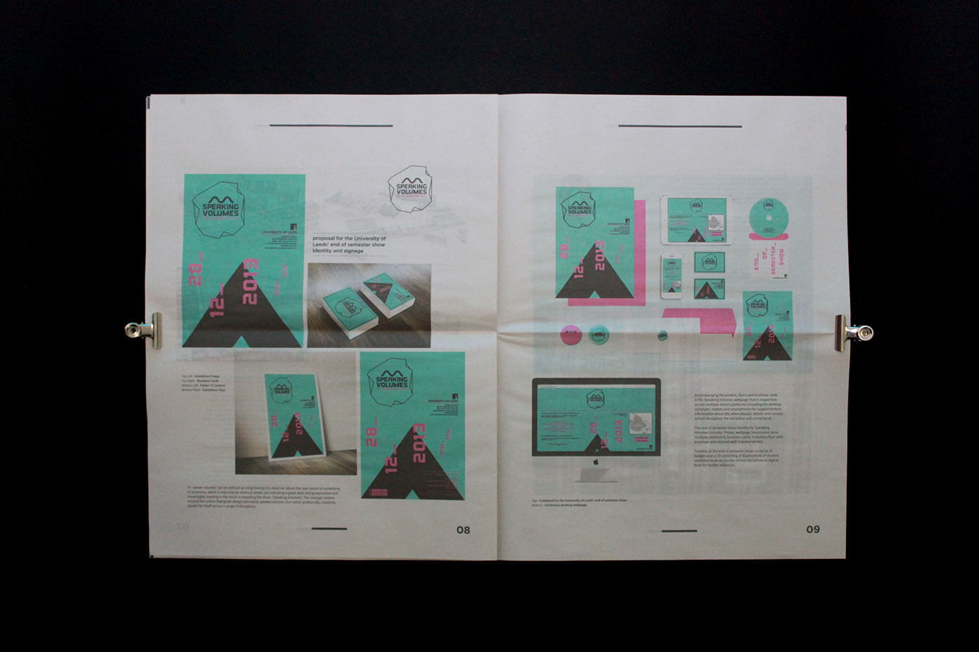
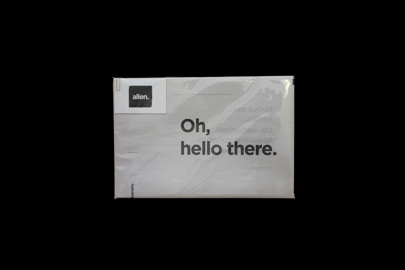
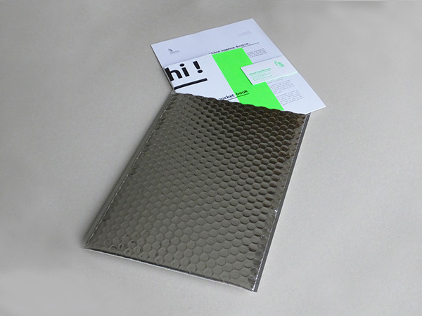
I decided to design a portfolio book along with a business card. Once the portfolio book and business card was finished I wanted to make sure it turns up in style by choosing an envelope that's eye catching and visually exciting. The portfolio book contains my favourite pieces of work from an overall standpoint, showcasing a contemporary style but making sure I include example of digital work too. The overall style and aesthetics of the book reflects my branding with a clean, modern and contemporary aesthetics keeping with consistency with my overall brand.


Studio Brief 2 - Promo Pack Research

Below are some examples of the inspiration I ingested while trying to decide the direction I wanted my promotional pack to go in. I knew the style and aesthetic I was trying to achieve but the main aspect I needed to research was to see what other creative have done in terms of what they had in their promo pack and what was current and contemporary in the industry. The question of should I just have a portfolio book and a business card or a website and resume was a big area I needed to decide on.

The examples below gave me an insight into what other creatives have produced.

The promotion pack below contains a number of different elements that make up the pack. Designed by Charlotte Allen, the concept for the promo pack was based around the post and how the idea of postal service can influence a promo pack of a designer. In the pack contains a resume, portfolio newspaper and business card all within a clear envelope. Clear envelopes can come across cheap once you get your hands on it but it's an effective way to spark the client’s curiosity as they can quickly peak through and see a teaser of what's inside.


Bruno Banamore created modern, hands on approach to the self-promotion pack, taking advantage of the beauty and construction of envelopes. The promo pack showcases a resume and a business card. At first glance the whole pack may seem a bit simple and dull but aesthetically it's beautiful. Any designer would appreciate the craft and tangible features. The envelope is a thing of beauty, it forces the user to interactive with it, untying the envelope is a part of the experience and would say a lot more then a normal envelope with a lot more inside.

However, this style of envelope wouldn't be appropriate for my style or branding due to the function of the envelope. The appearance of the envelope comes across as someone who is into hand rendered techniques.


Below is the work of Rémi Rechtman. He's promotional pack contains a collateral of a portfolio book, business cards and a resume. The use of the vivid green showcases he's hand on approach with screen printing, instantly expressing who he is as a designer. 

The most influential aspect i took from Rémi's promo pack is the envelope he put his work into. The envelope screams out to you demanding attention. The shiny visuals are easy on the eye and would instantly be noticed once it lands on someone’s desk or through a letterbox. It's unique and different to just a normal envelope, it also expressive a designers touch, thinking about every aspect and stage of the development process. Why create such a beautiful portfolio pack and just send it away in an £1.99 envelope from the post office. It would be a shame and a waste of potential. It's inspiring to see how all details are considered and this is an envelope that I can take inspiration from and use for my own portfolio pack.


Wednesday, 16 March 2016

Creative Report Evaluation

The creative report was a bit of a roller coaster. Trying to get David Carson reply I knew from the start it would be difficult considering that he’s a busy man and a big celebrity in the world of Graphic Design. I had to find a way to spark his curiosity, I eventually got it by sending a simply email but with a difference. I knew he was massive lover of surfing and also has a funny, down to earth personality. Therefore, in the subject line of the email I put a surfing joke “Why did the surfer cross the beach” and though and behold he reply with the most casual response of “Send away, yer title werked”. This good luck didn’t last for long as once I sent him the questions he didn’t reply back…what a shame. With this backlash I had to find another creative in a short period of time. I wanted to find someone close to where I lived so I can actually film then instead of just a phone call or email. I wanted it to be personal and get the most out of this opportunity. I then thought about my design manager from back home. I don’t really know a lot about her as a designer or her story through Incisive Media. With that in mind I felt like it was a great opportunity to film her and ask her about her roots into the company and her opinions about working within a corporate environment, which is one question I always wanted to know.

So I set up the interview and arranged the date and everything went smoothly. Emma and I ran through the questions together before hand so she could prepare for the questions and to make sure I also got the most out of it. The most valuable moment throughout the whole process was during the interview. I had no previous experience interviewing people and I could tell that Emma was naturally a bit nervous about being interview. So, when the interview got started it felt very rigid and robotic almost as if Emma was memorizing her answer word by word but it was until something humorous was said that the interview turned into a discussion. I could tell the exact moment Emma eased up and began to relax, the answers felt more truthful and not staged, and once she began to relax I did too and that as a whole made the interview more beneficial for me as an deep insight into the company and my understanding of interviews and knowing how people work within the surroundings of one.

Overall the creative report was extremely insightful for my development with outside industry professionals. It gave me the confidence to know what I need to do to approach any studio or professional. Through John’s sessions he made it clear the type of approach we needed to get the attention of someone. He taught us that it’s not effective enough to just send a bog standard email and expect a reply the first try. It’s about doing something that is unique and will make you stand out from the crowd. We should think outside the box when trying to get the attention of a studio. Why send an email when you could letterpress or screen print the letter. Going a bit further will inevitably impress the recipient. As they’re going to be designers themselves they will appreciate the lengths you went to, to impress them.

Module Evaluation

Overall, the PPP module started slow but was beneficial and eye opening. When the module was first briefed I was very nervous about brief 2. The creative report was a brief where I had to start thinking about studios and industry profession for real. I knew I had to actually start contacting people and asking for interviews, which is the aspect that scared me the most. I had to get out of my comfort zone if I wanted to create a report that was effective and hit all criteria of the brief.

After hearing John’s sessions about the best way to contact professionals, I went away from that session feeling somewhat confident that I could contact someone big in the industry. I began researching all types of studios and professionals that were a big interest to me as a designer. I then decided to contact David Carson, I thought I had no chance with Big Dave but I thought I’ll try to come up with something quirky and funny, so I research about him, he’s personality and interest and from that I sent him an email… and he actually replied back to me. This was the best moment from the module, a reply from David Carson. However, this luck eventually ran out, as he didn’t reply back to me after I sent him the questions. I eventually got in contact with Incisive Media and managed to hold a video interview with the design manager, Emma Gibbs, which worked out perfectly in the end.

The most useful skills I learnt on this from this module were communication and organisation skills. The interview had to be communicate and organised down to the last detail as Emma was a busy person and I had to make sure she was happy with the interview question and if she was okay about being filmed. My weaknesses of the module have to be the negligence of the work. Due to the pressure and workload from responsive I had to prioritise response over PPP and that effected how much extra I could have got done. I know that If I had more time I would of worked longed on my promotional pack but due to time It wasn’t possible but I was still happy how It turned out in the end.

It was very interesting to see how I had adapted and changed from last year. I’m no longer the same designer as I was last year; a lot of aspects such as interests and style have all developed through influences and other briefs. Last year I was confident I would stick to the post-modern style in level 6 but I’ve completely changed and have been producing work with modern and contemporary aesthetics. I’ve realised how important moving with the times are as I need to keep myself updated with current trends to give my work to best chance of exposure and to avoid an out-dated style.

It was eye opening to reflect on level 4 and to see how much I’ve changed and now In level 5, I’ve changed my identity to reflect my current styles and interests so It’ll be interesting to see how I will adapt and change next year.

Studio Brief 1 - Teal Triggs Talk

To inform my understanding of The Telegraph brief for D&ad, Simon suggested that Lo and myself go to a lecture by Teal Triggs (what a great name) a professor of Graphic Design at RCA. Teal's lecture was based Women and Self-publishing around feminist and independent fan zines. Her talk was very inspiring for my responsive brief but to see how feminist zines have changed very little through out the years.

Teal Triggs talked about independent magazines that emerged out of 1970/80s & 1990s. Teal also analyses zines to demonstrate the role publications played within the feminist movements throughout the years, as well as discussing Graphic Design techniques and features used within to also help the movement. Teal Triggs talks about zines such as Spare Rib, Collective, Bikini Kill, Aggamengmong Moggie, Ablaze, Riot Grrl and many more. Is was interesting to see most zines mentions show an aggressive and sometime explicit approach to the independent publications, from the names of the zines to the front cover. For example the zine Riot Grrl changing the adaption of 'girl' to 'grrl' making it sound like a growling noise, making girl seem more masculine and aggressive instead of seen the feminine side of the word girl.

Overall, the talk was very inspiring to hear from such a well-established professor. After the talk I did add her on all forms of social media in case I need her experience or help with any thing to do with publications or the feminist moment


Studio Brief 1 - Branding Update

Last year I branded my identity as 'Child', since then I've re-evaluated my current identity and made changes to my self-branding.

The problem?

Looking at my current branding I felt it wasn't an accurate reflection of me as a designer. 'Child' was more of a brand then a self identity, I felt the concept and approach to Child was effective but it all came across as a company and not a self-identity and it wasn't how I wanted to represent myself. I wanted a self-identity in which was unique to me and fully represented my strengths and who I was as a designer and a personality.


OLD


New Identity

The new identity keeps one main feature from the old. The image of me as a child, the child image is a key identity for myself, it becomes a talking point for when I hand out my business cards. Breaking the ice is essential to gain a relationship to any potential clients and the image of me will give me that opportunity. I also see the image as the logo of my identity, no type just my cute baby face. This is because the name of my identity is 'Jack' and that particular name is extremely popular therefore, to make my self stand out was to push my baby picture as the actual logo and the name 'jack' will be there so clients no what to call me.


As I previously mentioned 'Child' was changed to 'Jack' to give a personal feel to myself as a designer  and to avoid the confusing with Child. Aesthetic wise my updated identity used the same minimal colour scheme of black and white. As my interests throughout the year changed I've tired to reflect this within my identity. I've become more interested in digital design and surrounded myself with more of an contemporary style where as last year I was more interested in post-modern aesthetics. To reflect this I've change the type face to a contemporary option of universe and kept the whole style and look of my new business cards contemporary and modern to represent me as an inspiring upcoming designer.

Updated

Studio Brief 1 - Literacy skills

Back in school I wasn't the best-behaved student. This led me down a path of the typical ‘I know it all’ attitude that young people have in school when a teacher repeatedly tells you that school is important for you. This rubbish attitude led me to eventually receive poor grades in most subjects, especially in English. The main challenge I find with uni work is writing the COP essay, as I'm not as educated on writing styles and essay writing. However, even though I achieve a first in last years COP, I was still surprised that my essay didn't let me down.


I still realise that I'm struggling to express myself when it comes to analysing my work to my best ability. Therefore, I'm thinking of taking a course in English In the summer to take a class or two just to catch up through what I missed in school and to learn about writing styles and essay structures.

Tuesday, 1 March 2016

Studio Brief 1 - Creative Report Final

As the filmed interview was complete and finished, the next step was to convert the interview into a visual resolution that represented the message behind Emma's interview and to also represent Incisive Media as a company. For me Emma's interview gave me an insight into how Incisive Media has developed and adapted to the digital boom. Over the years Incisive Media have been exploring new ways adapt their print magazines, publications and event collateral digitally.Through animation and online publishing sites like Wordpress the company have successfully transitioned most of their print material into online versions reaching a bigger demographic but not completely disregarding print as a majority of their older demographic is accustomed to print. 

The explanation above is what I'm trying to convey in my report publication. Demonstrating with design decisions to showcase Incisive Media as a corporate B2B business by using a modern, structured & sophisticated style. The other aspect I will be demonstrating with this publication is showing that the printed publication can still be effectively used and viewed when produced digitally on any device or software.

Below is my finished report. The designs incorporate a mix of corporate layout and aesthetics with a contemporary style to avoid the publication becoming outdated. This is one of the fundamental aspects which I noticed with the corporate style especially within Incisive Media. The corporate style is outdated and dull, dismissing all current contemporary trends which can be implemented within the corporate style to make the overall aesthetic more current.


As the print publication was finished, below is the digital version mockup up on an Ipad. The same style and aesthetics have been used but the layout has been adapted to fit the resolution of the Ipad. The digital version demonstrates the transformation of Incisive Media going from print to digital and this Ipad version successfully communicates this.


GIF