The examples below gave me an insight into what other creatives have produced.
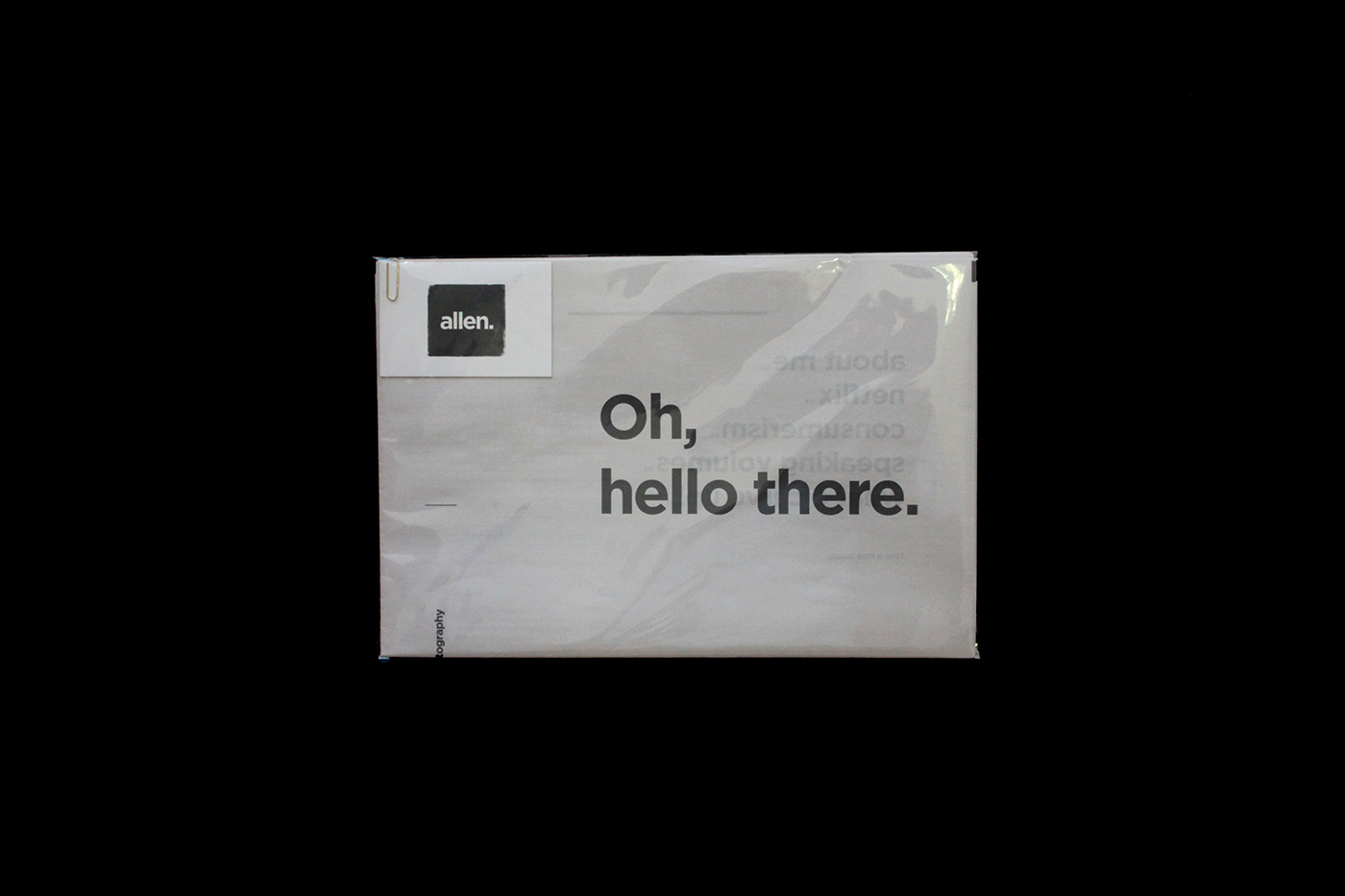
The promotion pack below contains a number of different elements that make up the pack. Designed by Charlotte Allen, the concept for the promo pack was based around the post and how the idea of postal service can influence a promo pack of a designer. In the pack contains a resume, portfolio newspaper and business card all within a clear envelope. Clear envelopes can come across cheap once you get your hands on it but it's an effective way to spark the client’s curiosity as they can quickly peak through and see a teaser of what's inside.

Bruno Banamore created modern, hands on approach to the self-promotion pack, taking advantage of the beauty and construction of envelopes. The promo pack showcases a resume and a business card. At first glance the whole pack may seem a bit simple and dull but aesthetically it's beautiful. Any designer would appreciate the craft and tangible features. The envelope is a thing of beauty, it forces the user to interactive with it, untying the envelope is a part of the experience and would say a lot more then a normal envelope with a lot more inside.
However, this style of envelope wouldn't be appropriate for my style or branding due to the function of the envelope. The appearance of the envelope comes across as someone who is into hand rendered techniques.

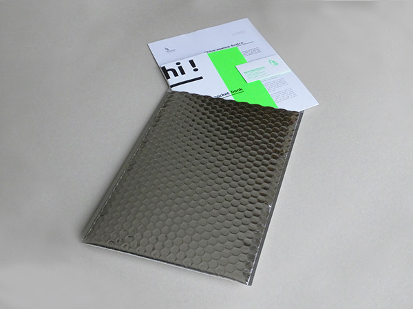
The most influential aspect i took from Rémi's promo pack is the envelope he put his work into. The envelope screams out to you demanding attention. The shiny visuals are easy on the eye and would instantly be noticed once it lands on someone’s desk or through a letterbox. It's unique and different to just a normal envelope, it also expressive a designers touch, thinking about every aspect and stage of the development process. Why create such a beautiful portfolio pack and just send it away in an £1.99 envelope from the post office. It would be a shame and a waste of potential. It's inspiring to see how all details are considered and this is an envelope that I can take inspiration from and use for my own portfolio pack.

No comments:
Post a Comment